Your content team built strong material. Your campaigns get people to the site. What happens between the click and the answer is where members are getting lost.
thunder::tech · March 2026
We crawled every major page on messa.org, tested your search with real member questions, checked heading structure, navigation, and mobile content experience. We traced the paths a member takes when they need to find a doctor, look up a medication, get mental health support, or sign up for Teladoc.
We also looked at what's working. There's a lot of it. The Welcome page, the mental health hub, the menopause page, and the pregnancy page are standouts. The content is genuinely good. The gaps are in how people find it and what happens when they land on it.
What We'll Cover
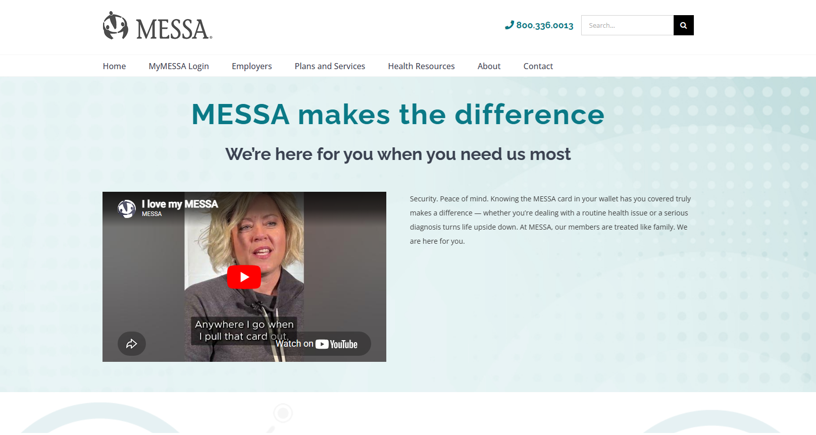
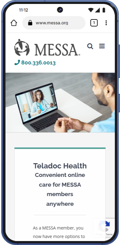
She clicked an Instagram ad. She's stressed, burned out. She lands on Here For You.
Lands on Here For You. Three member stories. Heartfelt.
Looks for a next step. A link to Teladoc. A button for mental health. Anything.
Nothing. Three stories, three quotes, the footer. No links to Teladoc, NurseLine, the mental health hub, or anything actionable.
You drove her there and she was ready. The page gave her feelings but no direction.


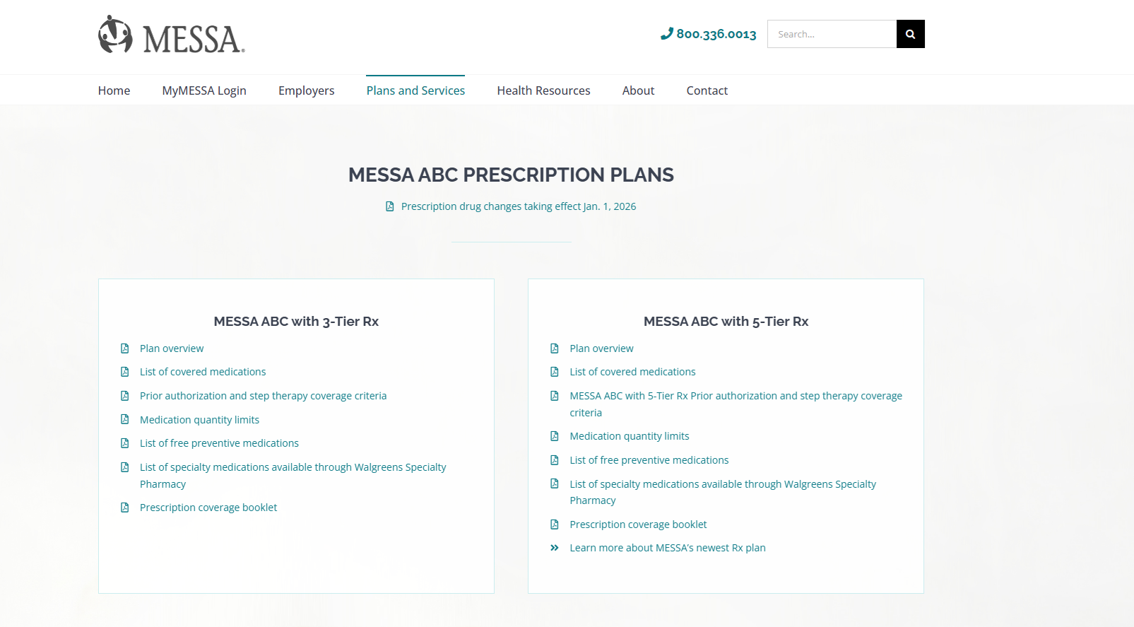
Goes to Prescriptions. Good so far.
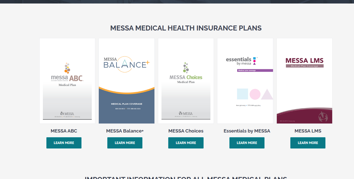
Has to know her plan type. ABC? Choices? Balance+? Essentials?
Has to know her tier. 3-Tier? 5-Tier?
Downloads a 127-page PDF. Opens it. Ctrl+F.
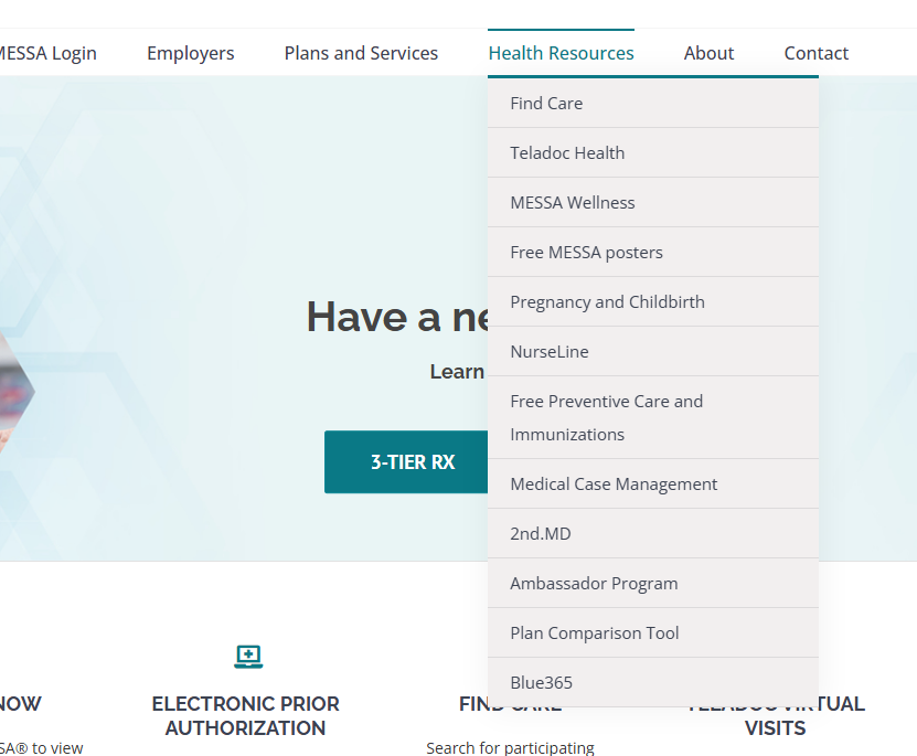
Four decision points before the actual task. The Rx Plans page has 53 PDF links.
Concept: MESSA Card Helper
MESSA MEMBER CARD
Member: Jane Smith
ID: 123456789
Plan: MESSA ABC · 3-Tier Rx
"Look at your MESSA card. Your plan tier is printed right here."

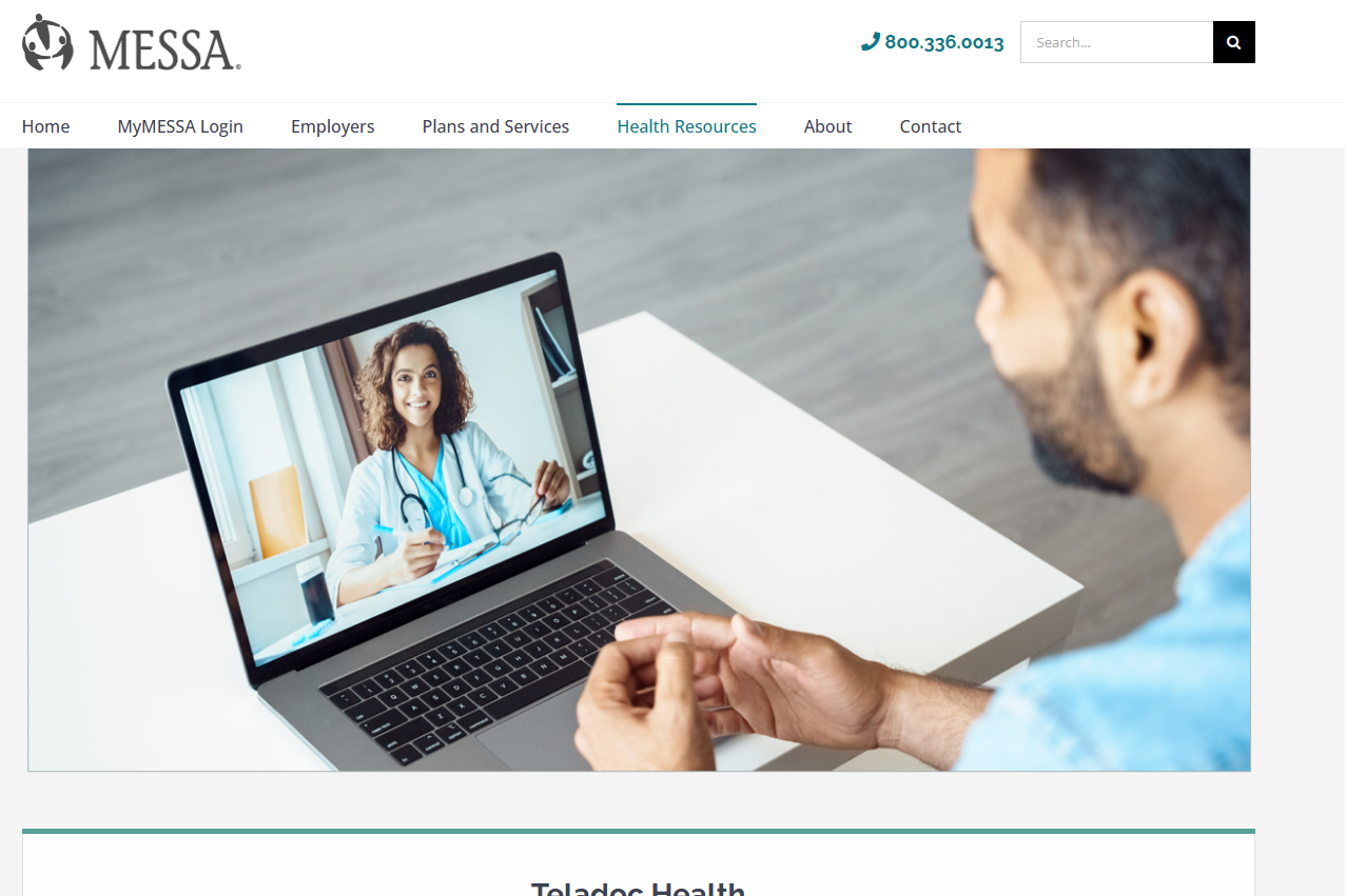
Finds the Teladoc page. Navigation works here.
Massive hero image. Nice, but no register button visible.
Reads features. 24/7 Care, Mental Health, Virtual Primary Care. No button.
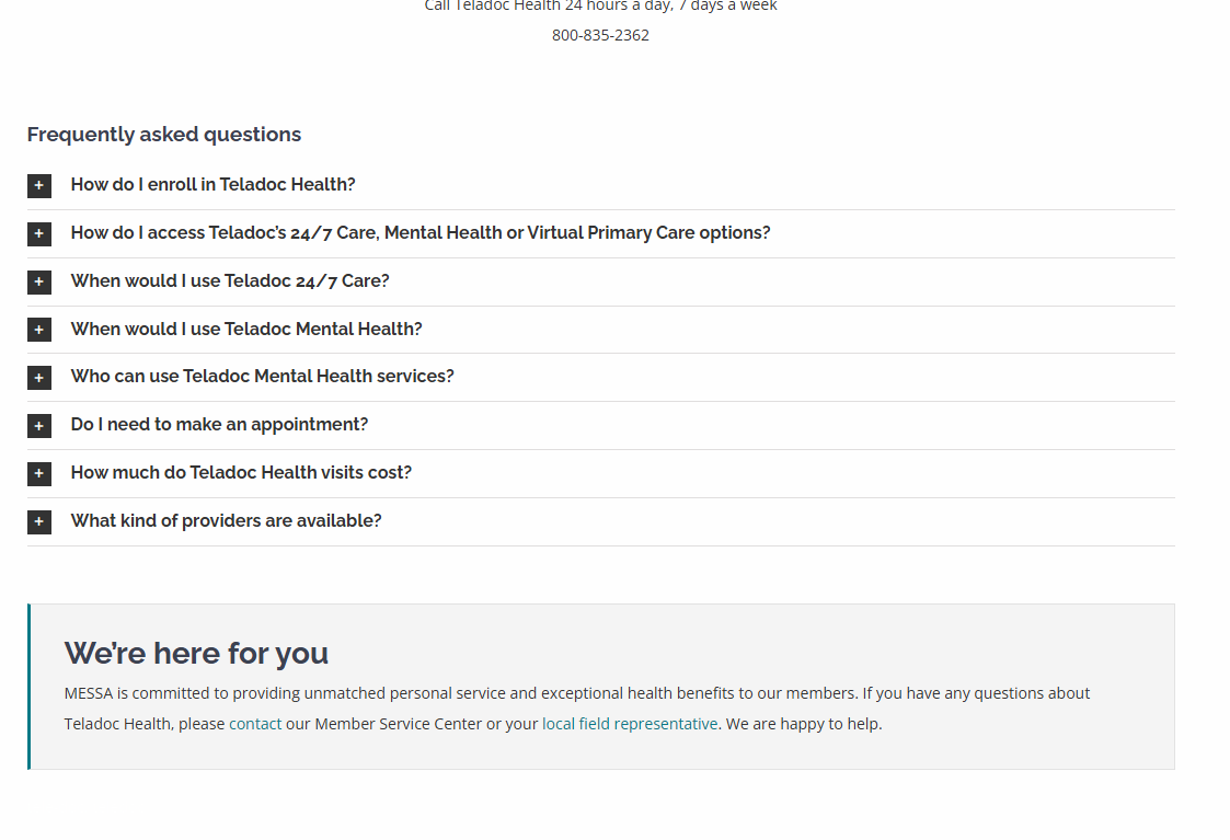
Wants to know cost. Hidden in a FAQ accordion.
"Go To Teladoc" is at the very bottom. The thing he came to do is the last thing on the page.


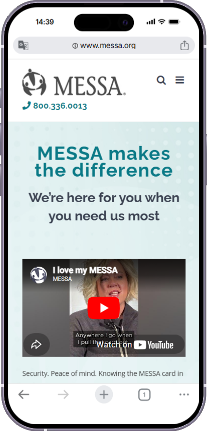
Teachers checking benefits during lunch. Bus drivers looking something up between routes. The mobile experience is where the hero-size problem and the PDF problem hit hardest.

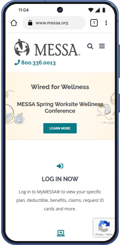
The entire first screen is the carousel and login. Content is several swipes down.

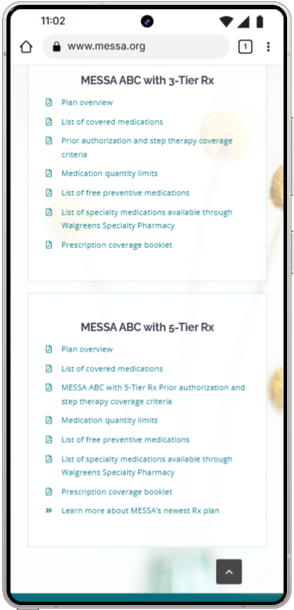
PDF links are nearly impossible to use on mobile. Can't search inside them, can't scan them.

A sticky CTA bar at the bottom of mobile would catch members ready to act.
Nearly every page starts with a large branded hero. Members know they're on MESSA. Their eyes skip the branding and look for content that isn't there yet because it's below the fold. On a school-issued laptop (1366×768), the entire first screen can be just the hero.
Affected: Here For You, Health Resources, Plans and Services, Teladoc, Menopause, Wellness Conference.
Benchmark: the first piece of actionable content should be visible without scrolling. The Welcome page already does this. That's the target.
Every page needs a main heading that tells browsers, screen readers, and search engines what the page is about. Think of it like a chapter title in a book.
Right now, 11 of your 12 pages are missing theirs. It's like a book where every chapter starts with body text and no title. Screen readers can't announce what page the member is on. Search engines can't determine the topic. Your own site search gets confused.
This is likely a theme-level issue. One fix at the template level improves every page.
| What they searched | What came back | |
|---|---|---|
| "therapy" | Hinge Health, 3-Tier Rx | No mental health page |
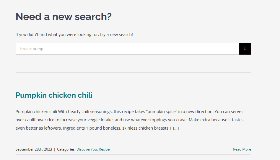
| "breast pump" | Pumpkin chicken chili (#2) | Recipe in results |
| "mental health" | Mental Health page | Works |
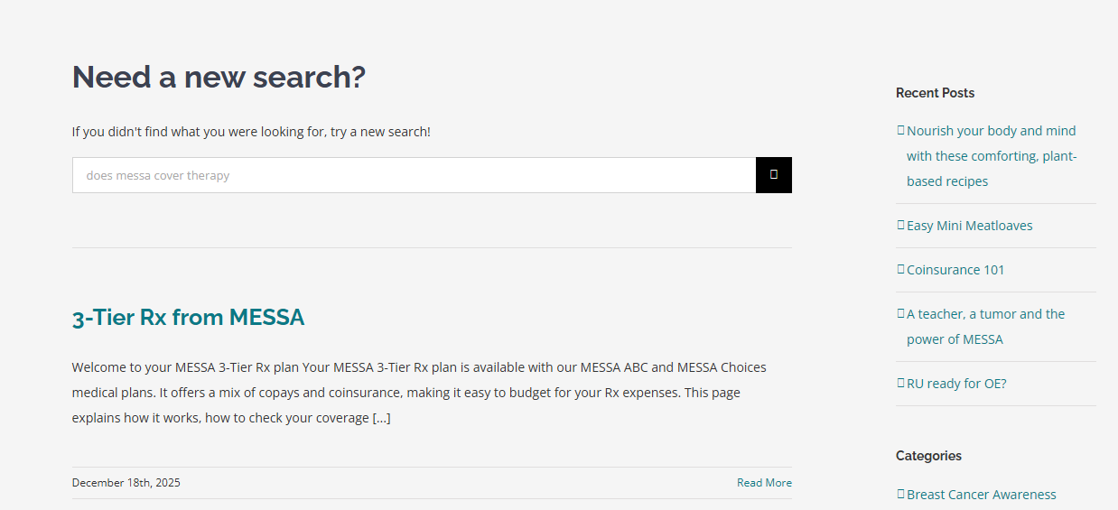
| "does messa cover therapy" | 3-Tier Rx, Supplemental | Irrelevant |
| "deductible" | Blog posts about resets | No plans page |
| "find a doctor" | Vaccination article | Find Care is #2 |
| "copay" | Rx plan pages | Works |
The broken H1 structure contributes to this. Search and SEO both suffer when pages don't have clear heading hierarchies.


The current split between "Plans and Services" (12 items) and "Health Resources" (12 items) doesn't match how members think. Here's one way to break it up so no dropdown is overwhelming.
Medical Plans
Dental
Vision
Prescriptions
Life & Disability
Supplemental
FSA
Plan Comparison Tool
Teladoc Health
Find a Doctor
NurseLine
Medical Case Management
2nd.MD
Hinge Health
Mental Health
Menopause
Pregnancy & Childbirth
MESSA Wellness (worksite)
Preventive Care & Immunizations
Discover You
MyMESSA Login
MESSA App
Member Forms
Page consolidation opportunity: NurseLine + Free Preventive Care + Immunizations could collapse into one "Preventive Care" page. Blue 365 moves to footer. Ambassador Program moves to About. Posters move to the Wellness worksite page. This needs a card sort or tree test with real members before implementation.
These pages get the structure right: acknowledge the member's situation, show options, explain cost, link to the thing. Even these pages could benefit from tighter heroes, but the content approach is sound. The pregnancy page (messa.org/ohbaby/) is another standout: anchor links at the top, plan-specific accordions, a closing section that links to the service center, field rep, and app.

Welcome page. Content starts immediately. Clear CTAs. Surfaces the app, Teladoc, Hinge Health.

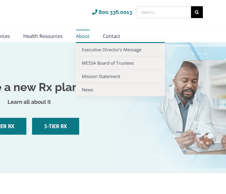
Mental Health hub. Multiple pathways, 988 crisis line. Just needs to be in the nav.

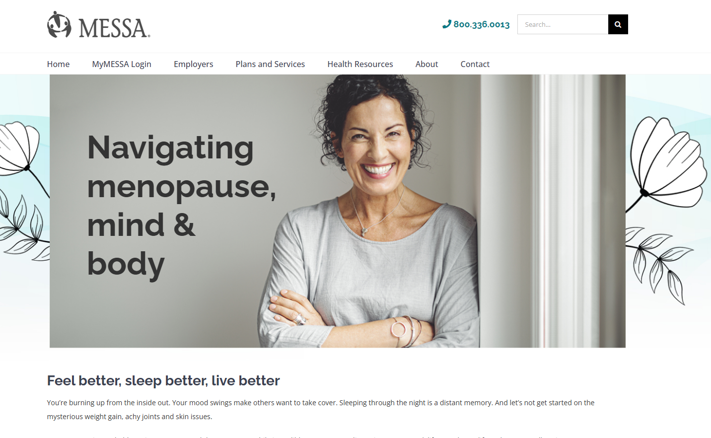
Menopause page. Clear structure, connects to Hinge Health and Ovia. Not in the nav.
The homepage is a portal launcher. Health Resources is a wellness hub. Plans and Services is an insurance desk. The answer to this question shapes what gets prioritized next.
Content team scope. No platform changes needed.
Add "Not sure which plan?" to the homepage carousel
Surface app download near the portal login
Add a persistent "New to MESSA?" nav link
Move Discover You out of About
Add plain-language summaries above plan thumbnails
Surface the Plan Comparison Tool prominently
Add a step-by-step flow for disability claims
Write short descriptions for top PDFs
Redirect old blog posts competing with hub pages
Build a content expiration calendar
Improve search headings and metadata
Consolidate: NurseLine + preventive care + immunizations into one page
Sticky CTA bar on Teladoc + mental health (mobile)
Separate CTAs per Teladoc service section
Convert formulary drug lists to searchable web pages
Break Plans and Services into child pages
Simplify the poster order form
Install a search plugin (Relevanssi or SearchWP)
Add breadcrumbs on subpages
Card sort or tree test on navigation labels
Navigation restructure (see proposed option)
Comprehensive accessibility audit
Add XML sitemap
We'll send over the detailed plain-text version with mobile content experience notes, hyperlinked quick fixes, and all screenshot references.
Your content team can start on the 20 items that need no platform support.
Heatmaps, GA4 access, call center top reasons, existing personas, field rep feedback. The more we see, the more precise the next round gets.
We'll present to the full team when you're ready.
thunder::tech